Simulated Client*
Smokin’ Po Boys BBQ
Objective
Smokin’ Po Boys
Brand Design and Seasoning Packaging
*This project was completed for a school assignment, not contracted

Where did we start?
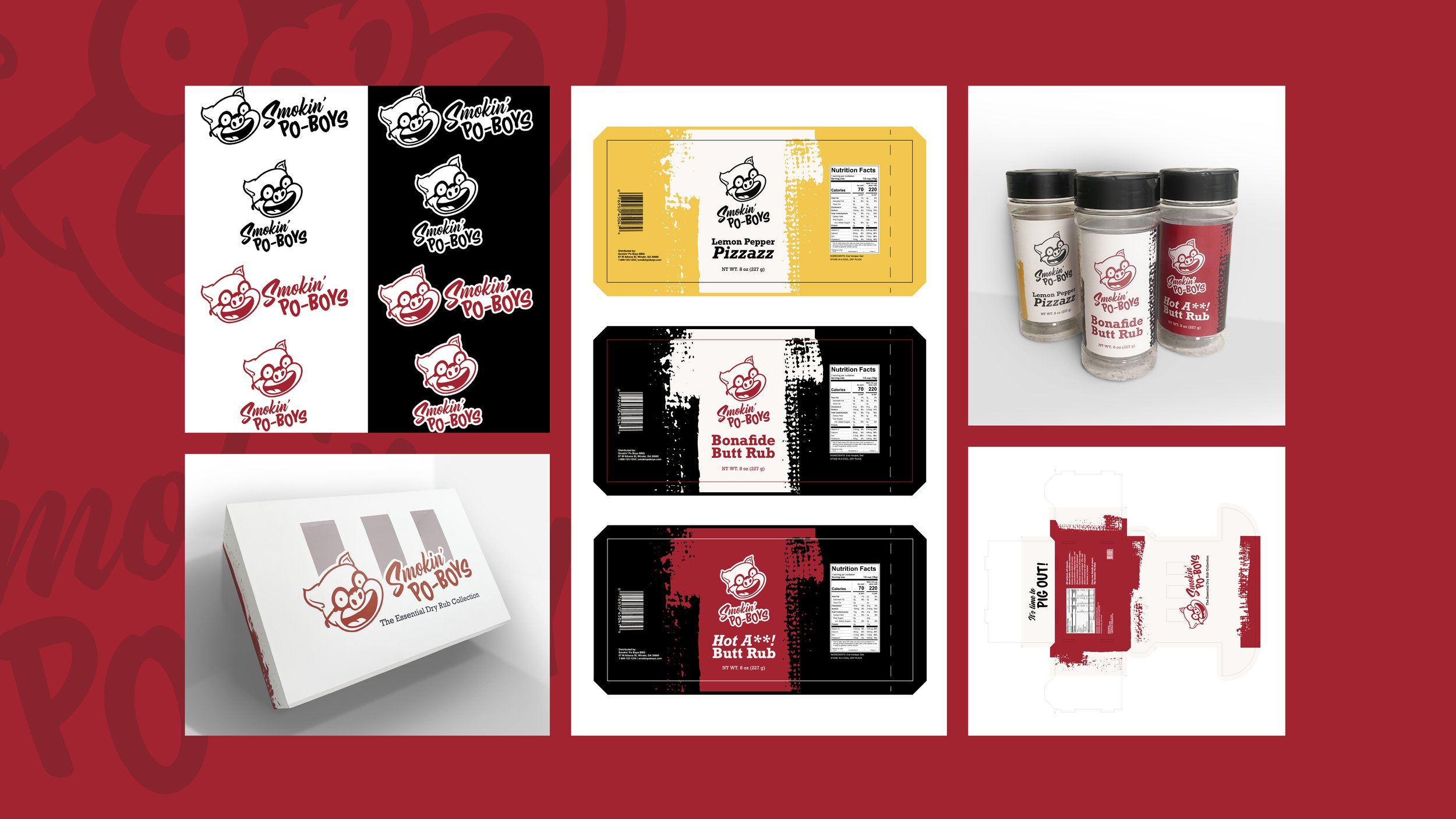
Smokin’ Po Boys — a small-town BBQ joint in Winder, GA — already boasts a strong tonal voice: friendly, casual, old-school, and a little snarky. However, there is room for a more cohesive brand identity. My goal was to keep the voice, but give them a thumbprint.
I leaned into mom-and-pop shop, classic, painted signage. Additionally, I pulled inspiration from their prize-winning pig mural, and other popular southern identities.


Workshopping
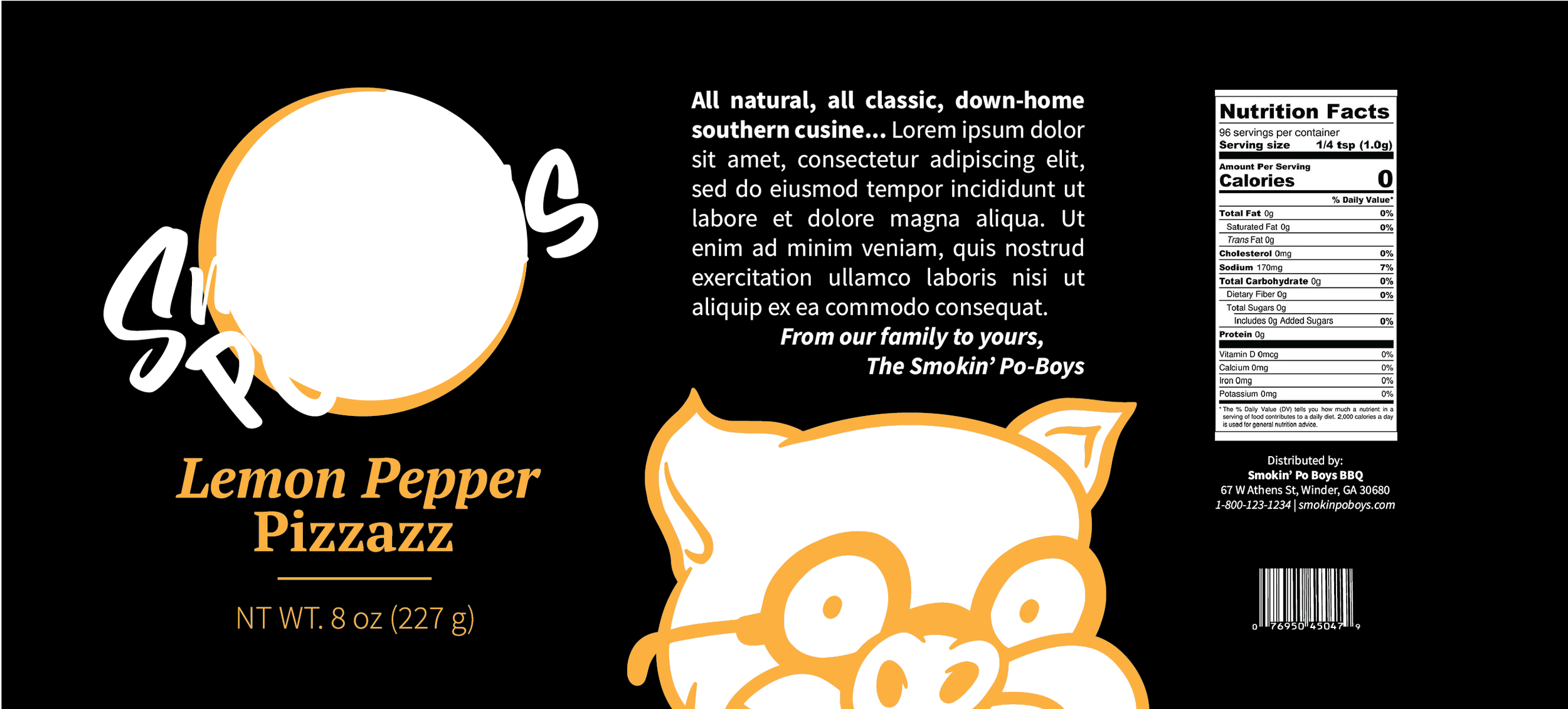
In my original designs, I created a refined illustration of the pig mascot and settled on typography and colors. I also worked to showcase more of the brand’s voice, including a personal message from the founders, and catchy names for the seasonings.
While these concepts are solid, when I revisited this project, there were several things I decided to adjust to find a more solid solution.


Finished Solution
In revisiting this project, I kept several key aspects of my original solutions: color scheme, type, mascot, and the cut of the box layout. However, I adjusted formatting, added some textures, removed unnecessary pieces, and evaluated shelf presence more thoroughly.
The final box layout sticks out from other brands’ rustic cardboard designs for seasonings and sauces with a bright white background. The seasoning wraps are more visually striking, and the imagery doesn’t get lost on the cover.
With this new design, Smokin’ Po Boys can attract new consumers while staying true to their home community.


